
A rental company in a fast-moving industry needed a visual system that could brand equipment on the fly—without full wraps, without custom jobs, and without losing recognition in a sea of machines.
Context
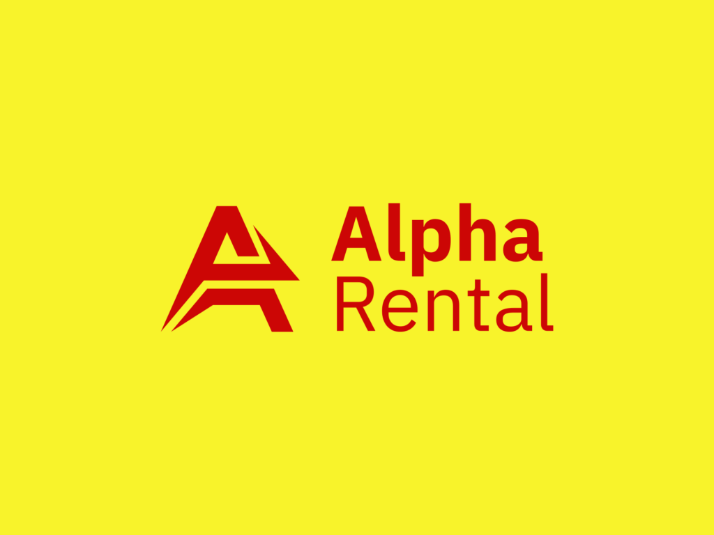
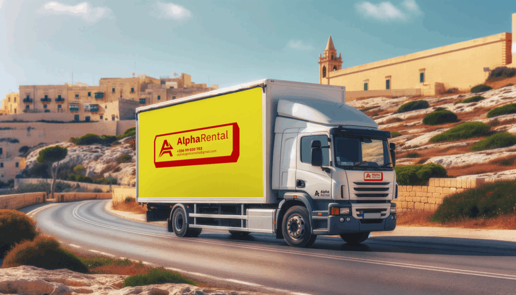
Alpha Rentals operates across Malta, providing event equipment, vehicles, and industrial gear for short- and long-term use. With machinery constantly in motion—often placed alongside equipment from other contractors—the brand struggled to remain visible or recognisable on-site. Full wraps were rarely practical due to cost, time, or surface irregularities. Yet, without a system, their presence disappeared into the background. The goal was to create something durable, visible, and deployable in real time—without redesigning every machine.
Fit & Intent
The brief was focused: keep the name, keep the monogram—but update the presentation and make it work in tough, visual, real-world conditions. This wasn’t about making something “beautiful.” It was about function: being noticed, being remembered, and being unmistakably Alpha in a cluttered environment. The conversation quickly moved past branding theory into practical questions: What do we do when there’s no budget or time for wrapping? How do we compete with machines that are already bright yellow, green, red, or blue?
Direction
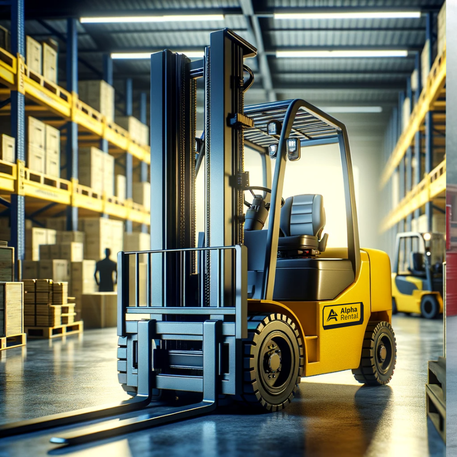
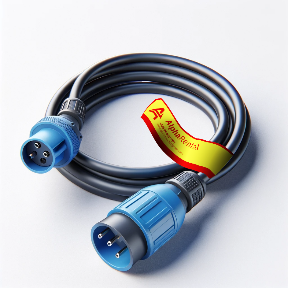
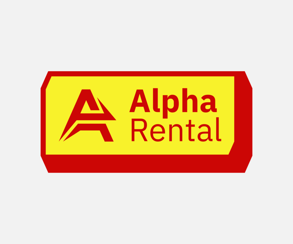
The approach centred on building a labelling system, not a visual identity in the traditional sense. Alpha’s inventory was reviewed and mapped out colour conflicts, material constraints, and size variability. Standard industrial signal colours were used as a base, then subtly refined to create a recognisable palette. The solution: a boxed label format with a hard border, designed to contrast with any equipment colour, housing the logo and contact info. In larger applications, the sticker shape itself became a distinctive visual asset—awkward, utilitarian, and entirely deliberate. Branding through stubborn visibility.
Outcome
Alpha Rentals now has a scalable, field-tested identity system that works across the board—from forklifts and trucks to wire tags and helmet labels. The core shape and contrast-first layout allow the brand to stay consistent whether applied as a pre-cut sticker, laser-etched plaque, or spray-stencil. It’s instantly recognisable on the street, on-site, and in photographs—not by design trend, but by purpose. No guessing, no “did we brand that?” Just presence, everywhere it matters.